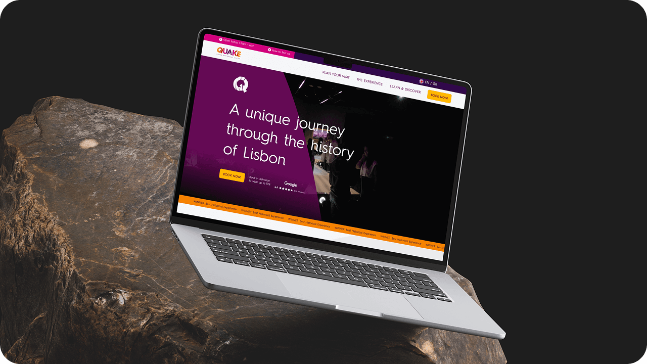
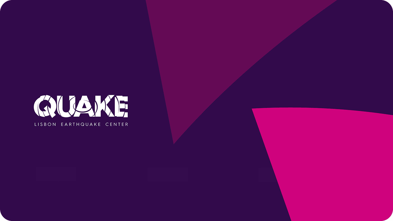
Building the Brand Identity for Lisbon’s Most Groundbreaking Experience
We created the brand identity for Quake Lisbon — an immersive cultural attraction blending entertainment, history, and science to help audiences truly “expect the unexpected.”
Measurable impact of digital transformation
The Challenge
Quake Lisbon Earthquake Center set out to do something few cultural spaces attempt: turn one of Europe’s greatest natural disasters into an unforgettable educational experience. The challenge was to build a brand that felt urgent, relevant, and globally resonant — without being perceived as “just another museum.” The strategy had to address a deeper human truth: people underestimate the importance of historical seismic events until they feel their impact. Our task was to craft an identity that brought history to life with energy and emotion — transforming awareness of the past into a call for preparation and resilience.
The Solution
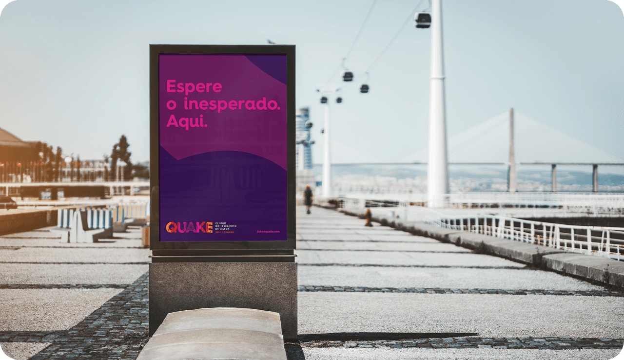
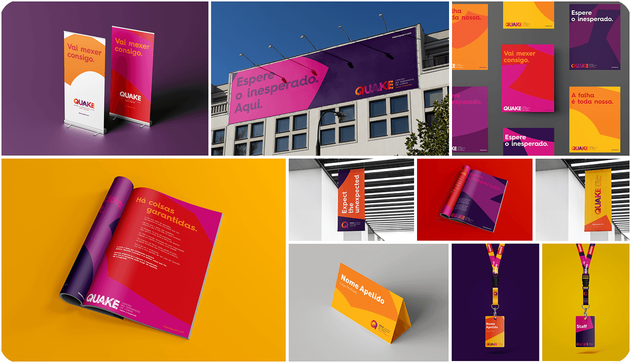
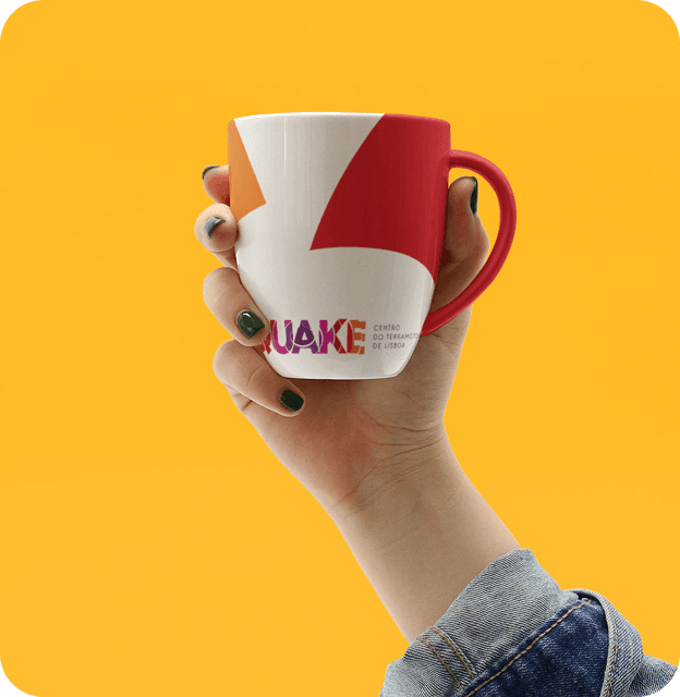
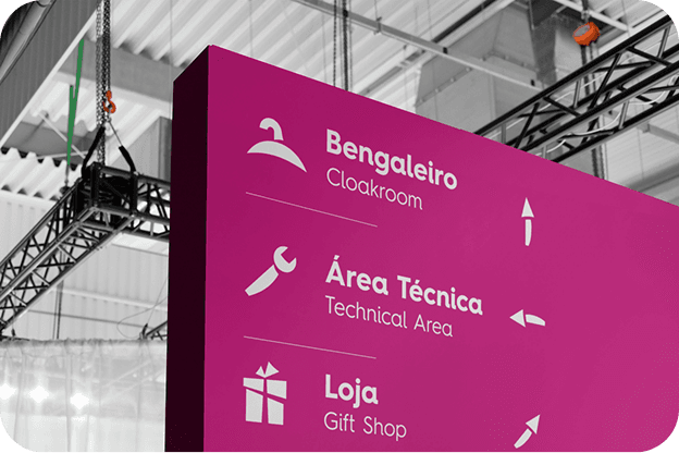
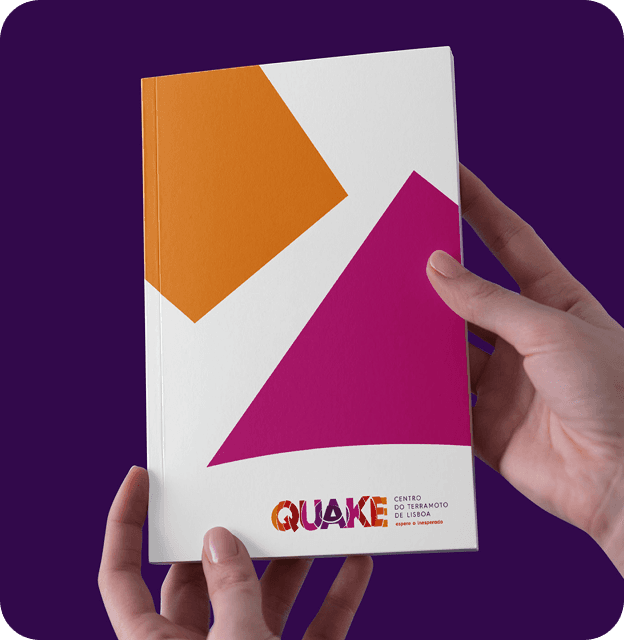
We built the entire brand strategy around a single, vital idea: Preparation. From this purpose, we positioned Quake as a “ludic, sensory, and pedagogical experience” — an intersection of Entertainment, History, and Science. The creative direction fused emotional storytelling with scientific precision, captured through a visual identity that felt both stable and fractured. The logo’s bold, fragmented typography mirrored seismic movement, while the tagline — “Expect the Unexpected” — embodied both Quake’s narrative tension and its educational mission. Every design and message element was codified in a comprehensive Brand Book, laying the foundation for a cultural brand built to last.
The Result
The brand launch positioned Quake as one of Lisbon’s most innovative cultural experiences — a place where history, science, and emotion collide. The new identity gave the attraction a distinctive and authoritative presence in the city’s competitive tourism landscape, balancing entertainment value with educational impact. Visitors are now greeted by a cohesive visual and verbal language that commands attention and curiosity, while reinforcing the deeper purpose of preparedness. Quake’s brand doesn’t just represent a venue — it represents a mindset: a reminder that understanding the past is the key to surviving the future.
“The brand perfectly captures our mission — it’s not just a logo or a tagline; it’s a living idea that invites people to feel, learn, and prepare.”

“The brand perfectly captures our mission — it’s not just a logo or a tagline; it’s a living idea that invites people to feel, learn, and prepare.”
“The brand perfectly captures our mission — it’s not just a logo or a tagline; it’s a living idea that invites people to feel, learn, and prepare.”
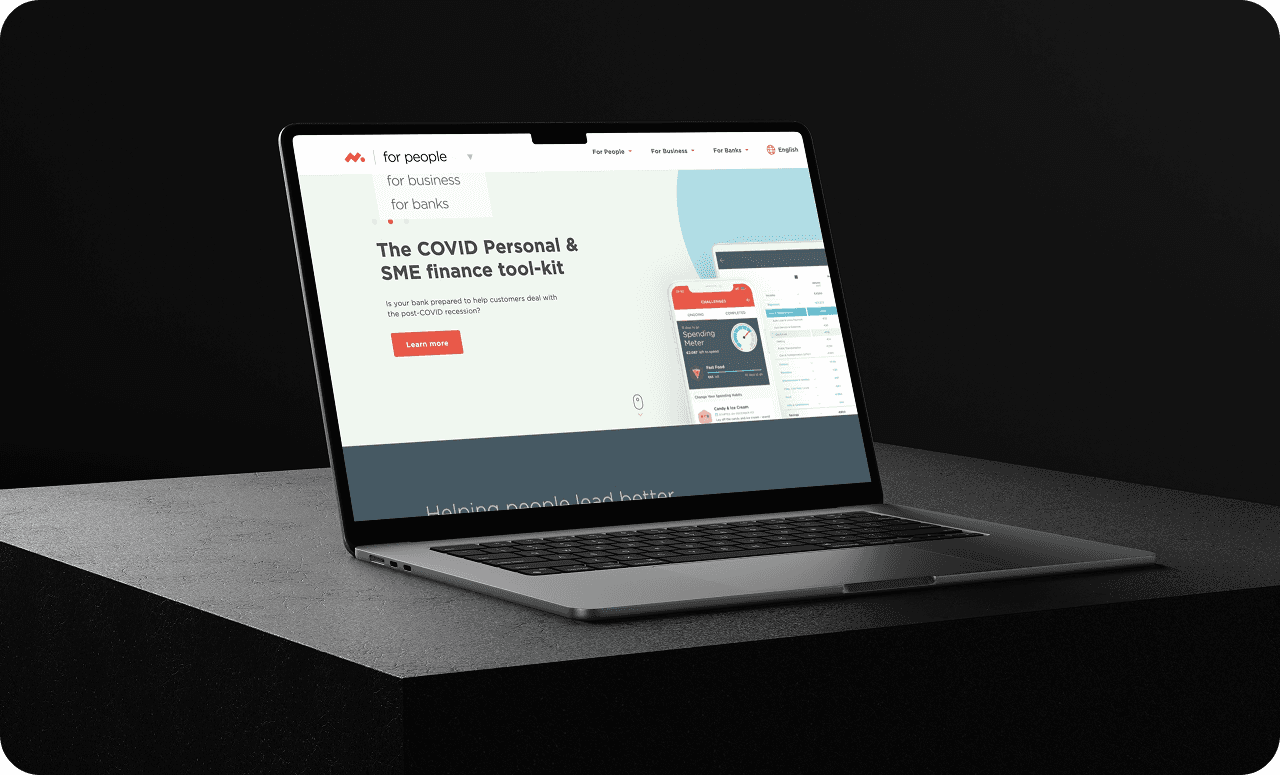
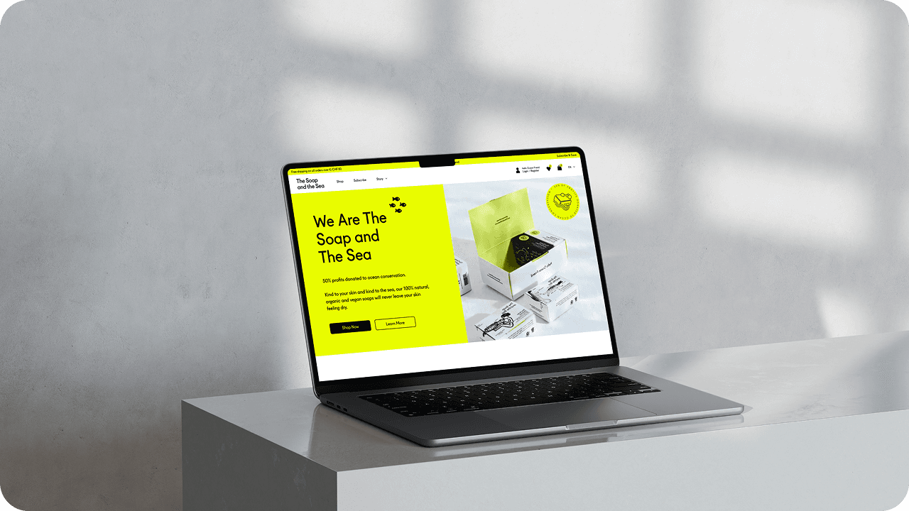
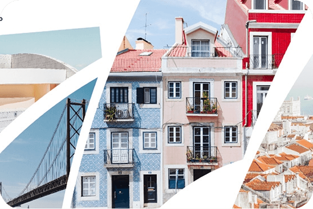
Visual journey
Moments that capture the essence of digital transformation
Start your digital journey
Let‘s create a digital solution that transforms your business performance
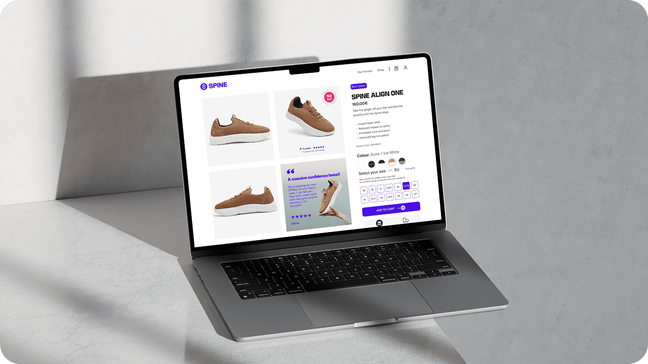
More projects
Take a look at other projects we‘ve delivered