Building the Brand Identity for Spine: Where Science Meets Style
We created the complete brand strategy and identity for Spine — a D2C footwear brand merging biomechanical science with contemporary design to inspire confident, pain-free movement.
Measurable impact of digital transformation
The Challenge
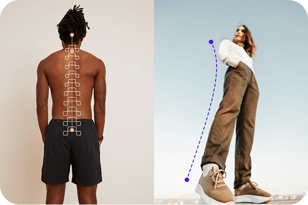
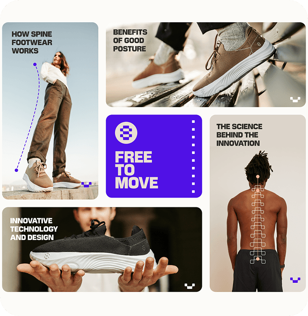
Spine set out to enter one of the most competitive categories in D2C: footwear. But unlike typical lifestyle brands, its proposition was rooted in medical science — shoes engineered to improve posture and reduce back pain. The challenge was to build a brand that could do both: earn trust through scientific credibility and inspire desire through design. The identity needed to speak to consumers seeking both health benefits and self-expression, balancing functionality with fashion. Our task was to create a unified narrative that translated a biomechanical concept into a brand built for movement, confidence, and modern life.
The Solution
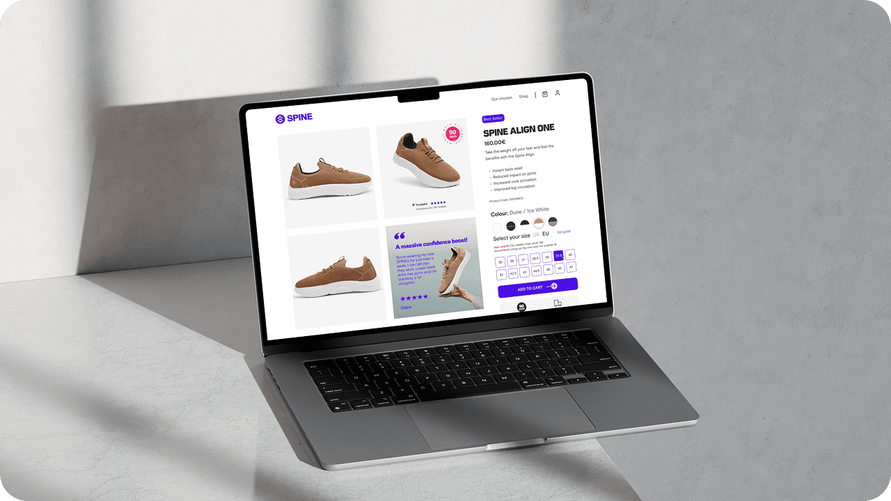
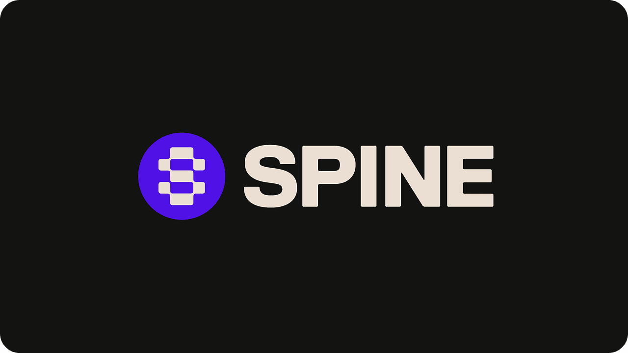
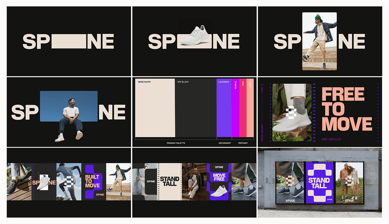
We developed Spine’s complete brand and go-to-market strategy around a single idea: INSPIRE MOVEMENT. This concept became the foundation for every creative decision — from naming and logo design to tone of voice and art direction. The visual identity was built around the “S” icon, an abstract representation of vertebrae in motion, forming the spine itself. Typography balanced energy and professionalism through Marche Super and Basis Grotesque, while photography and layout design emphasised strength, alignment, and freedom of movement. A vertical motif, drawn from the logo’s structure, anchored every composition — visually reinforcing the product’s medical benefit: perfect posture.
The Result
The result is a brand that confidently bridges science and style. Spine’s new identity system combines trust and aspiration in equal measure — medically grounded yet fashion-forward. Every visual and verbal element reinforces its mission: to help people move better, live taller, and feel stronger. The distinctive “S” symbol and vertical art direction provide instant recognisability across digital and physical touchpoints, while the “INSPIRE MOVEMENT” idea ensures long-term creative cohesion. The brand now stands as a credible challenger within both the medical and fashion footwear markets — built to scale, to stand out, and to move people forward.
“The brand captures everything we wanted — authority, energy, and emotion. It feels scientific without being sterile, fashionable without being superficial. ‘Inspire Movement’ became more than a line — it became our mission.”

“The brand captures everything we wanted — authority, energy, and emotion. It feels scientific without being sterile, fashionable without being superficial. ‘Inspire Movement’ became more than a line — it became our mission.”
“The brand captures everything we wanted — authority, energy, and emotion. It feels scientific without being sterile, fashionable without being superficial. ‘Inspire Movement’ became more than a line — it became our mission.”
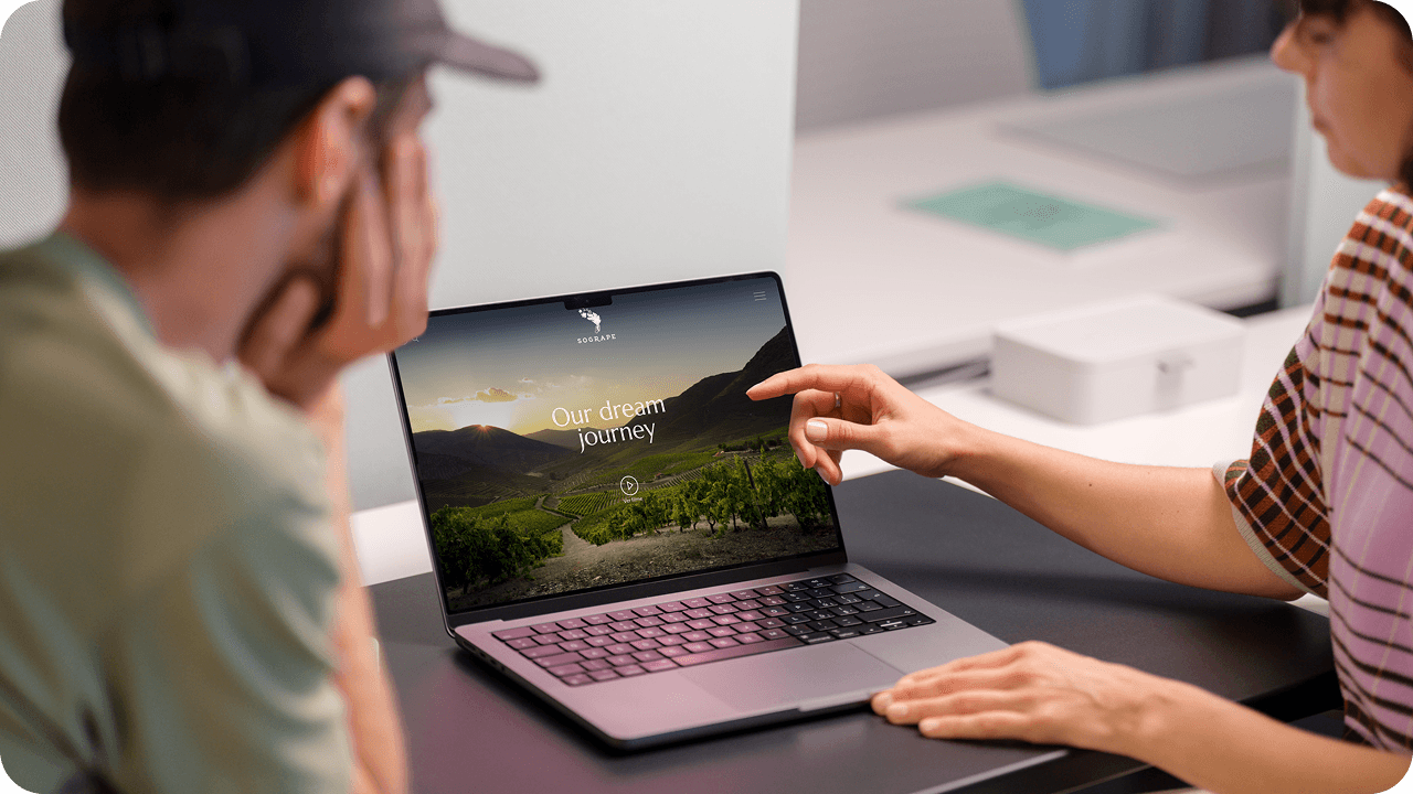
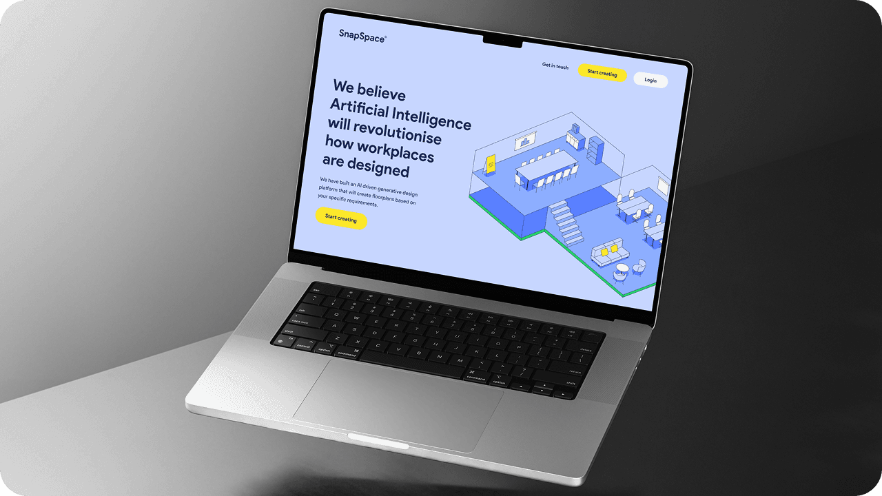
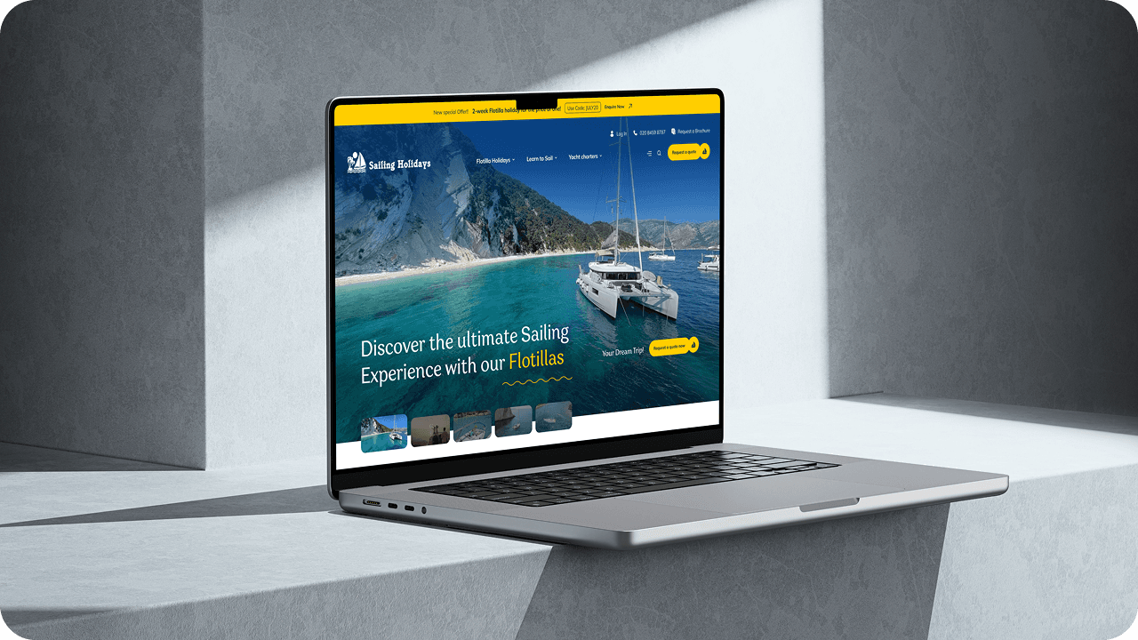
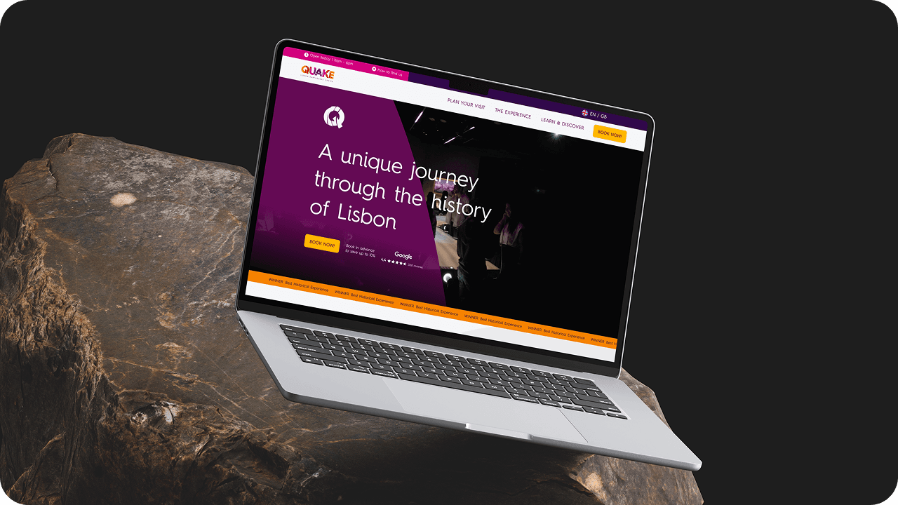
Visual journey
Moments that capture the essence of digital transformation


Start your digital journey
Let‘s create a digital solution that transforms your business performance
More projects
Take a look at other projects we‘ve delivered